Microsoft Fabric Sample Architecture Diagram

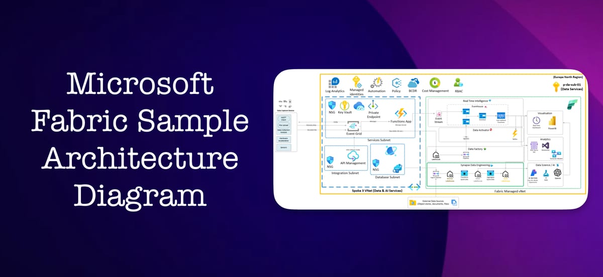
I was recently preparing a presentation for an introduction to Microsoft Fabric during which I wanted to briefly talk about where Fabric fits in a typical hub and spoke Azure Landing zone as well as showing the end-to-end processing of data in Fabric for downstream consumption. Admittedly, some high level diagrams exist for the latter, but I wanted to present this slightly differently as well as showing processing of multiple data types - I always find it helpful to consider these visually.
Fabric in Azure Landing Zones
First, a few core concepts (Microsoft information). Microsoft Fabric is enabled at the tenant level, and must be attached to a subscription, resource group, and region. In the below example, I’ve aligned the Fabric capacity to a “data and ai” subscription in a landing zone spoke. It’s worth mentioning highlighting that it’s entirely possible for the Fabric box (green dotted line) to exist without any additional complexity, but I’ve included some examples like private endpoints to highlight that Fabric can be configured to meet more complex security or networking needs - see the network security documentation for more information. Lastly, alongside using the Microsoft backbone network for integrating with any Azure resources, Fabric enables native access to any data the user has access to at a tenant level, so you could imagine the dotted green box being extended to other subscriptions.

Fabric-specific architecture
A simple overview of the medallion architecture is available via Microsoft (image below). I also stumbled across an automotive test fleets example Microsoft shared, but could only see the base image that I wanted to extend and have something editable for going forward.

So, alongside my visual updates, the below visual combines these two examples to provide an example of implementing multiple types of ETL processes and consumption.

Finally, the real value I wanted to share here is the Visio file (from this GitHub repo) for the above Fabric diagram so you can use the icons or adapt to your needs, as this was the most time consuming part of my preparation as I appreciate that the concepts are already covered through the various content openly available but only with specific images that aren’t always the best for visual representation. I’ve stored this on GitHub, but please also share any suggestions or feedback and I’m happy to produce other examples. Note, the base landing zone diagram was authored by a colleague before I added the data & ai subscription so I’m not comfortable sharing that openly just yet.